
Summary of Michele Cagan's Stock Market 101 IRB Media

논픽션
Unearth the potential of Bootstrap 4 to create highly responsive and beautiful websites using modern web techniques
About This Book
• This book shows how to take advantage of the all new features introduced in Bootstrap
• Learn responsive web design and discover how to build mobile-ready websites with ease
• Find out how to extend the capabilities of Bootstrap with a huge range of tools and plugins, including jQuery,
• Do more with JavaScript and learn how to create an enhanced user experience
Who This Book Is For
If you want to learn to build enterprise-level websites efficiently with Bootstrap, this book is for you. You must have a basic and fundamental understanding of HTML, CSS, and JavaScript; however, there is no need to have prior Bootstrap experience.
What You Will Learn • Fire up Bootstrap and set up the required build tools to get started
• See how and when to use Flexbox with the Bootstrap layouts
• Find out how to make your websites responsive, keeping in mind Mobile First design
• Work with content such as tables and figures
• Play around with the huge variety of components that Bootstrap offers
• Extend your build using plugins developed from JavaScript
• Use Sass to customize your existing themes
In Detail
Bootstrap, the most popular front-end framework built to design elegant, powerful, and responsive interfaces for professional-level web pages has undergone a major overhaul. Bootstrap 4 introduces a wide range of new features that make front-end web design even simpler and exciting.
In this gentle and comprehensive book, we'll teach you everything that you need to know to start building websites with Bootstrap 4 in a practical way. You'll learn about build tools such as Node, Grunt, and many others. You'll also discover the principles of mobile-first design in order to ensure your pages can fit any screen size and meet the responsive requirements. Learn to play with Bootstrap's grid system and base CSS to ensure your designs are robust and that your development process is speedy and efficient. Then, you'll find out how you can extend your current build with some cool JavaScript Plugins, and throw in some Sass to spice things up and customize your themes. This book will make sure you're geared up and ready to build amazingly beautiful and responsive websites in a jiffy.
Style and approach
With the help of several real-world examples and code, this book will teach you to build a full-featured responsive website in Bootstrap, which is mobile-ready.
© 2016 Packt Publishing (전자책): 9781785888595
출시일
전자책: 2016년 8월 26일


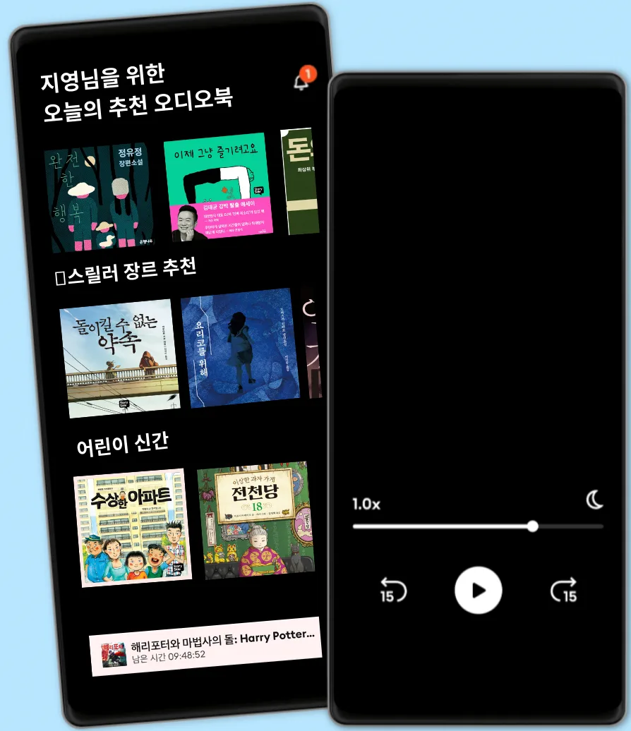
국내 유일 해리포터 시리즈 오디오북
5만권이상의 영어/한국어 오디오북
키즈 모드(어린이 안전 환경)
월정액 무제한 청취
언제든 취소 및 해지 가능
오프라인 액세스를 위한 도서 다운로드
5만권 이상의 영어, 한국어 오디오북을 무제한 들어보세요
13800 원 /월
사용자 1인
무제한 청취
언제든 해지하실 수 있어요
친구 또는 가족과 함께 오디오북을 즐기고 싶은 분들을 위해
매달 21500 원 원 부터
2-3 계정
무제한 청취
언제든 해지하실 수 있어요
21500 원 /월